Unless you've been hiding under a rock for the last year and are completely oblivious to Mid- Day Crisis you will know how phenomenal their year has been!
I first met up with MDC in August 2009 when the youthful group were eagerly anticipating the results of their alevels, accompany this they were attempting to 'make it' as Indie/Alternative girl band despite contrasting reviews and befuddling thoughts on how they would conform with today's demand for original contemporary modern music. Nearly a year on a top ten single 'For You' and an EP titled 'Optimistic Is An Understatement' predicted for early June we met up once again on set of their new video where the question on every journalists lips was how it feels to have such a dramatic change in such a short time - and how it feels to be Britain's biggest break through act of 2009.
EC- Hello again ladies, I must say it is a pleasure to meet up again. Now id say your year has been spell bounding to say the least, how would you describe the last twelve months?
EC- You must be overwhelmed by all the support you have received?
EC- So how did you all first connect with each other?
EC- The music industry is said to be like a rollercoster ride of ups and downs, what have you learnt so far?
EC-Who and what influences and inspires you most?
EC- Which is your favorite song off your new EP 'Optimistic Is An Understatement'?
EC- You all have a bold image you portray, would you ever be worried your style would be more recognisable than your music?
EC- You don't seem to follow the hype like a lot of young women your age, why?
EC- Where do you see yourselves in ten years time?
EC- Your songs dare I say have been described as 'pop' would you agree with this?
EC- So will you be doing any gigs any time soon and can you shed any light on rumours about you supporting 'Precious Time' in May?
EC- If you could work with any other artists who would you want to work with?
EC- Well thank you very much for taking time out of your crazily busy shedual to talk to the Ear Candy readers and best of luck with everything!
Friday 26 March 2010

Thursday 25 March 2010


Contents Photos
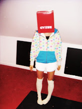
After my teacher feed back i decided to make a significant change to the contents and even use different people as otherwise i have used the same people in my photos throughout the whole magazine and although it shows continuity it doesn't link to existing magazines as they have various different photographs on each pages. I have photographed two of my friends Lauren and jack and added contrast to the photos to make them brighter and more professional looking, i have used a boy as well to contrast the other photos.


Polariod Tests

I did this so see how my style of photo would look in a polariod as I wanted to use them somewhere on my magazine as they are vintage/retro and that is all linked well into my indie genre. Im happy with how it works I want captions under the photo like song lyrics etc not just their names to make it stnad out more.
Sunday 21 March 2010
Contents Page

After my feedback on my contents page I decided to do another page using different effects and see how it worked, i don't like this much i don't think it flows well in terms of continuity to the front or double page spread I'm happy with the block shapes behind the text as i think it draws your eye more to the most important part, the text. my teacher suggested that it didn't flow well as my title, text and images are all in different corners, i agree i need to work on this page as i feel at the moment its the weakest.
Saturday 20 March 2010
Front Page

after receiving my feedback on how my cover was abit 'blocky' and the colour being bland i decided to use a brown background with a floral background on top to break it up abit and give it more colour and make it look abit more scrappy not so neat and organised. I also added the sweets I suggested as well, I think they work well but i need to re cut them as they will lose me marks at the moment because they are cut in weird angles and have areas where I have missed bits or cut into the sweet.
my feed back from this was they again it is too blocky with the white backgrounds and that the issue number in the corner looks more like a page number. my teacher also preferred my old font as he thinks it fits my genre better the more i look at it I agree. he does like the photos and text but thinks that it isn't necessary for two pictures of the same band on the front and that maybe I will find a better one than the main image I have as one of the girls heads have been cut off and so have the feet at the bottom.
I personally quite like this layout and i would pick this magazine up if I saw it on a shop shelf, but i also understand what my teacher has said so i will experiment further.
Text & Backgrounds

This is the scrabble text i am using on my double page spread for the name of the band 'Mid Day Crisis', I'm happy with the idea as it is different and quirky I'm also going to use the background which is a photo i took of a floral pattern in a magazine i like it as its girly and in fashion terms floral patterns are popular with indie styled people at the minute and also in general it makes a good background, I'm going to find other floral patterns to incorporate as well so their not all the same, this will add character to the pages.
Friday 19 March 2010
Market Research: Feedback
My feed back was very constructive that I received after asking my target audience what they thought about my magazine, they were generally impressed by it.
Everyone I asked liked my masthead as it was relevant to music but was also quirky and different to other mastheads that are slightly bland, like my teachers though they suggested that I should change the colour as it isn't very bold or eye catching, they like my photos and think they fit well with the theme and the genre of the magazine the only problem is they look very fashion like as apposed to a music magazine. The font I have chosen was liked by most people as well they like the style and how it looks like its been wrote on. when asked what they would add change and why they said I need more text and I should experiment with different fonts and sizes.
I then asked about my contents page most of the target audience response was that their favorite bit is how it is lay ed out on the page and the photos I have chosen to use. They also like the effect i have used and the headings as they fit in the genre I'm aiming at. When I asked what they would alter they said the page numbers in order and the bold text.
I then asked about my double page spread and they said they like the photos and the general layout of the page but in general they said it need a lot more work to be at the same standard as the other two pages, I also agree with this and I will do a lot of experimenting all the pages to get them looking the best I can
Thursday 18 March 2010
Sweets


For my magazine i want to take pictures of sweets or scan them in for my front cover as well as maybe my contents page to make it look more 3D and creative, i think this will also relate to the masthead name for the magazine and would be a theme that would run throughout every issue of the magazine. I have chosen cola bottles, jelly tots and dolly mixture as they are well known sweets and are bright in colour so they are very eye catching and will work with the slightly blander colours i have used for backgrounds and borders.

I also think that strawberry laces would look good as like borders and for outlining certain things like photos or words as again it is a Sweet and would continue the theme.
Wednesday 17 March 2010
Life On Mars - Gender & Ethnicity
Discuss the representation of gender and ethnicity
Ethnicity
Reference to the sari asian woman is wearing as a nighty
-joke
- not respectful
-racist
-misunderstood
Assumption asian has stole Tv, poor area. All baised on his colour.
Working Class Irish
-labouring, what english dont want to do 'shoveling shit'
-strong accent
talks about his farther, racism
-looks rough- clothes
-cut face- enigma code, beaten up by police.
-never met an irish man that doesnt like a drink- stereotyping
Bar man- black, dreadlocks, strong accent
Gender
Woman- reference to woman running the country
'wouldnt be a bad thing' 'you might regret saying that'
joke?
sexist comment about knickers- for a laugh, should police joke like that? used to it/ enjoys it?
Monday 15 March 2010
Monday 8 March 2010
Feedback- test

I decided to experiment with colour on my front cover after receiving my feedback, but i found that the bright more lively colours do nothing for my magazine as the genre doesn't really fit the colour, if it were a pop magazine then it would but as its to fit the 'indie' genre I'm not so sure, i like the font however, Pointy from dafont.com,as this does fit the theme.
Thursday 4 March 2010
Terminology
Conglomerate- Describes companies that own large numbers of companies in various mass media such as television, radio, publishing, movies, and the Internet.
Vertical Integration- A style of management control, companies in a supply chain are united through a common owner. Usually each member of the supply chain produces a different product, where all aspects work together to sell, distribute etc.
Synergy- Different company's cooperate use each others success for a final outcome.
Viral Marketing- Word of mouth.
Four Quadrant Audience- Old, young, male, female.
Niche- Narrow, specific target audience.
35mm Prints- Film that films are stored on.
British Film Institution Slogan- Love films, hate piracy.
Stock Writer- Write scripts.
Logistics- The management of the flow of goods eg films to the cinema.
Merchandising- Advertising products.
The Soloist
The Soloist is a 2009 drama film directed by Joe Wright, starring Jamie Foxx and Robert Downey Jr. It is based on the book, The Soloist by Steve Lopez. The film is based on a true story of Nathaniel Ayers, a musician who develops schizophrenia and becomes homeless.
Production Practices and Potential Problems
Production Practices and Potential Problems
Wednesday 3 March 2010

Teacher Feedback
Mood Boards: X
Example of other text/style models: Done
Analysis of magazine covers: Done
Title: Done
Pitch feedback: X
Shots of work on magazine cover including photoshoot: Done
complete mock version of cover/contents page/ double page spread & article: Done
Commment
Good use of text on cover. Cover abit too 'blocky' - also colour is abit bland for Ear Candy as a title. Photo is good
Masthead needs explaining in terms of placement - link to examples from existing magazines.
Contents page shows promise- would be good to see a few examples- so you choose the best layout.
DP Spread is poor - (i know its a rough version)- real attention must be paid to layout - placement of text and pictures. A good effort though
Quite a few parts have images and no text - needs amending
Research/Planning: Level 4
Practical Draft: Level 3
Subscribe to:
Posts (Atom)