http://blogs.warwick.ac.uk/michaelwalford/entry/glossary_of_magazine/
Left-side third: A lot of important information designed to attract potential readers is placed in the left-hand side vertical third of the front cover page. This is in case the magazine is displayed in a horizontal shelving system rather than a vertical one.
Masthead: The title of the magazine or newspaper. It is usually placed at the top of the front cover for display purposes.
Puff: Words or phrases on the cover of a magazine used to boost status
Plug: Information about the contents of a magazine or newspaper given on the front cover
Arousing curiosity: Ask the question ‘Why’. For example ‘Why our moisturiser has red hot chillies in it ‘. In women’s magazines especially the ‘how to...’ Construction. - How to get a boyfriend / Lose weight while eating even more ice cream / how to find out if he’s cheating on you.

Wednesday, 30 December 2009
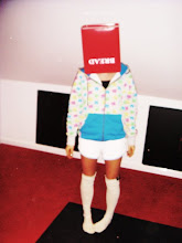
Scrabble Letters

Scrabble is a word game in which two to four players score points by forming words from individual lettered tiles on a game board marked with a 15-by-15 grid.
The letters inspire me as a font style for my Masthead, obviously i would have to change the style slightly so i haven't directly copied the idea. But i like the way they are individually placed to make words and they have a number that corresponds to the points you score if you place the specific letter on the board in the game, i think its really sweet and unique!
New Musical Express
NME

Is a popular music magazine in the United Kingdom which has been published weekly since March 1952.
I like the use of the acronym for their masthead, this has inspired me for my idea on a masthead.
Is a popular music magazine in the United Kingdom which has been published weekly since March 1952.
I like the use of the acronym for their masthead, this has inspired me for my idea on a masthead.
Tuesday, 29 December 2009


Thursday, 10 December 2009
Frey Willie Jewllery

FREY WILLE has a team of artists, goldsmiths and experts of fine enamelling, they are the only company worldwide that makes artistic jewellery with fine decorative art has reached global success across many different cultures. FREY WILLE’s jewellery is inspired by emotions.
They mix the creation of their jewellery with artistic and hand crafted genius which has in turn seen their success rising rapidly ever since 1951, when the company was founded in Vienna.
I really like the colours and different shapes that they use to create stylish and different jewellery, the colours and random designs interest me as they are quirky and look well thought out with significant well designs.
BLEND: attention to detail.

The masthead for this magazine interests me as the colour compliments the designers outfit she is promoting as the tracksuit is black and white and so are the colours used on the front page. I really like the way they have situated Cassette Playa so that her hair is set within the masthead this makes the half of the L E and D black and the other half of the L B and D white (the same colour as her hair). I like this idea as it is different and the detail is effective as it makes the magazine look very professional, neat and generally well made.
Wednesday, 9 December 2009
10

TEN magazine is a style magazine that focuses on luxuary, bespoke fashion. It defines the fashion market and sets trends for others to follow.
I like how the magazine is set out as it doesnt use two many colours, it is simple but effective. The text and fonts also add a unique edge to the magazine and make it more interesting than bog standard lettering but is still simple to produce.
The overall magazine would be really easy to re create but i think becuase the way it is put together is so simple it makes it more eye catching, for example the title is just two numbers '10' this will make people wonder why? a magazine that calls itself 10 must be slightly random!
Carri Mundane

Carri Mundane (Cassette Playa) is a fashion designer from London. she graduated in fashion design at the University of Westminster and since then has worked as a stylist for music videos and tours as well a developing her own fashion label.
Carri is also a contributing fashion editor of Super Super magazine, contributor and stylist for i-D, and has collaborated with Nicola Formichetti of Dazed & Confused magazine.
she has also worked with Nike and Billionaire Boys Club.
"I draw really heavily from ancient hunting rituals, but my collection was also inspired by Eighties and Nineties skate culture.
I personally like the way she uses bright bold colour and patterns with in her designs, you could also say that they go against the rules of fashion they clash and they do the donts or so to speak. its like she is trying to bring back the past with 80's inspired outfits! i like it, its different to the norm.

myfonts
MYFONTS is a website that sells digital fonts.
They have a very wide range of fonts all under different tags that you can try on the website and copy or buy. I will experiment with this website when i think about the title for my magazine as it is the best i have found for what i will need.
They have a very wide range of fonts all under different tags that you can try on the website and copy or buy. I will experiment with this website when i think about the title for my magazine as it is the best i have found for what i will need.
MGMT

MGMT formerly named "The Management are an indie/pop duo based in Brooklyn, New York.
They signed with Columbia Records/Red Ink/Sony in 2006.
Their first album as MGMT, Oracular Spectacular, debuted at number twelve on the UK album chart.
Synthpop, Indie dance, New Wave, Neo-psychedelia, Folktronica.
There music style is what inspires me most theyre song Electric Feel is an instant uplifting song and very easy to listen to, most of their songs off the album are similar some people would criticise this but i think it shows a focus.
this sort of style is what im looking for my 'band' to portray.
30H!3
3OH!3
(pronounced "three-oh-three") is an American electronic music group from Boulder, Colorado. Formed in 2004, they are named after the 303 area code in America. They are best known for their hit single "Don't Trust Me" and their recent single "Starstrukk" featuring Katy Perry who they toured with earlier this year.
I like their style both in music and in terms of fashion. they are different and wear bolds bright statement clothing some would class as retro. I also like their electronic music style as it is lively, fun to listen to and has amusing interesting lyrics it also compliments their fashion choice as apposed to contradicting it. I would like their style to have an impact on the 'models/Artists' i choose for my magazine and an impact on how the overall magazine looks.


Esquire Mens Magazine Barcodes


Since bar codes were introduced to magazine covers in the eighties they have been interesting designers. UK men's magazine Esquire have been making theirs quite quirky with the latest issue January 2010 being no exception having a smile incorporated into the bar code. This simple but effect detail interest me as a penitential thing to consider when designing my magazine.
MAX ROGERS


Max Rogers is a British model who has modeled for GQ and Vogue, and has done advertisements for urban outfitters when he first started and has progressed to D&G now.
I first saw Max on the runway at the clothes show in 2008 and again this year, he has an arrogant confidence which makes me good at his job, i want my 'band' to be able to show that they are confident with themselves as well as this will get me a better photo and therefore make my whole magazine more aesthetically pleasing because your eye is always drawn to the photo on a magazine so i need mine to do the same, but better.
Mario Testino

http://mariotestino.com/
Mario is a fashion photographer born and educated in Peru. He moved to London in 1976 were he lives permanently. He shoots for well known and respected fashion magazines such as Vogue and V he also photographs for various designers and models like D&G, Burberry and celebrity's such as Cameron Diaz and Gwyneth Paltrow. He continues to photograph the royal family on various occasion's.
Mario's photographs are all very different in my opinion depending on who or what he is photographing for, but have the same excellent quality and focus.


SUPERSUPER
SuperSuper Issue 15

I really like this style of magazine as it is very bright, loud and eye catching. The fonts, pictures and layout of the whole magazine is very random and unorganised looking i like this it gives the magazine an edge that others don't have.
I also like that as soon as you see SupperSuppers logo 'the smiley face' you know that it is their magazine id like my magazine to have a logo that you can tell belongs to it and is as recognisable as this one.
This magazine would be very easy to re create and looks like part of it may have been created on simple programs like Microsoft word or publisher foe example.
They also layer photos and text on each other, this would be done on photo shop and is similar to most magazines.
SuperSuper also keeps to other magazine conventions like 3fonts and a limited colour pallet. This particular issue uses 4 main colours blue, yellow, white and black. The other features it has is a masthead 'SuperSuper'(obviously), cover lines/words like 'Swagger' or lines like 'Will we all have hair in 2010'and then a price, date and barcode.
The double Page spread is split into a page of photos and a page of text this is an interesting layout as most magazines would incorporate text and photos within the same paragraph never mind page, yet again this makes SuperSuper different from other magazines. They also use simple shapes and column structures that again makes the magazine unique.
Page Spread

Coursework
For my media coursework i am making the front cover, contents page and double page spread for a music magazine. I want the magazine to be different to others that are available at the moment, however i will keep to using a 3 colour pallet, 3 fonts, layers, issue slogans and a masthead. I want to make my magazine bold bright and bizzare!
Wednesday, 2 December 2009
Key Terms Notes
Digital distribution- is the practice of providing content in a digital format, which is downloaded via the internet straight to a consumer's home. Digital distribution bypasses physical distribution media, such as paper or DVDs.
DSN(Digital Screen Network)- Digital screening cuts the cost of releasing films (a digital copy costs around one tenth of a 35mm print). That's why UK Film Council and the Arts Council England have created the Digital Screen Network – a £12 million investment to equip 240 screens in 210 cinemas across the UK with digital projection technology to give UK audiences much greater choice.
Film Focus- LUFF was launched in 2004 as an initiative for the export and promotion of new British films and talent to the international marketplace.
Product Placement- or embedded marketing, is a form of advertisement, where branded goods or services are placed in a context usually devoid of ads, such as movies, the story line of television shows, or news programs. The product placement is often not disclosed at the time that the good or service is featured.
Exhibition
1. How are independent and mainstream cinemas different in how they exhibit films?
Mainstream- is, generally, the common current of thought of the majority. However in the reality, the mainstream is far from cohesive; rather the concept is often considered a cultural construct. It is a term most often applied in the arts.
Independent- free from the influence, control, or determination.
They are different in how they exhibit films for a range of reasons one of which is budgets as mainstream will have more money to spend on getting you to the cinema unlike independent film companies as they won’t be able to do things such as 241 as they need as much money as possible. Mainstream have the opportunity to show films on the day they are released by distributors and to show films allot throughout the day where as independent cinemas can only show films at certain times. Film tickets are slightly cheaper at independent film cinemas to mainstream but there isn't much in it. Both have a completely different audiences, independent aim their films at an older audience that are interested in the film industry and they also use below the line advertising, unlike mainstream who use above the line advertising processes and aim at wider audiences.
2. Name three ways the UK film councils try to make films accessible to wider audiences?
The UK Film Council's Development Fund is the biggest of its kind in Europe with £15 million available over the next three years. The aims of the fund are to:
- identify and support new talent using a variety of schemes.
-invest in films that would not otherwise get off the ground.
-support new and cutting edge filmmakers working across all genres.
Digital Screening
improving access
for more information
3. How has the recession impacted on box office takings?
Box office revenue totalled £480.5 million, up 3% on 2007’s already record figure, while attendances for the year totalled 13.8 million - up 1%.
Cheaper night out and cheap entertainment- escapism.
1920's America the same thing happened with the wall street crash and depression.
4. How is the divide between independent and mainstream cinemas becoming less clear cut?
mainstream films are now appearing in independent cinemas around 6 months after they are distributed to mainstream cinemas this is because the distributors want to make as much money from films as possible and because they will distribute them cheaper so independent can afford them.
digital distribution will also allow a wider spread.
5. Monopolization
Majority of the market share.
within film no institute does however they strive to, which makes competition.
Subscribe to:
Posts (Atom)