http://blogs.warwick.ac.uk/michaelwalford/entry/glossary_of_magazine/
Left-side third: A lot of important information designed to attract potential readers is placed in the left-hand side vertical third of the front cover page. This is in case the magazine is displayed in a horizontal shelving system rather than a vertical one.
Masthead: The title of the magazine or newspaper. It is usually placed at the top of the front cover for display purposes.
Puff: Words or phrases on the cover of a magazine used to boost status
Plug: Information about the contents of a magazine or newspaper given on the front cover
Arousing curiosity: Ask the question ‘Why’. For example ‘Why our moisturiser has red hot chillies in it ‘. In women’s magazines especially the ‘how to...’ Construction. - How to get a boyfriend / Lose weight while eating even more ice cream / how to find out if he’s cheating on you.

Wednesday, 30 December 2009
Scrabble Letters

Scrabble is a word game in which two to four players score points by forming words from individual lettered tiles on a game board marked with a 15-by-15 grid.
The letters inspire me as a font style for my Masthead, obviously i would have to change the style slightly so i haven't directly copied the idea. But i like the way they are individually placed to make words and they have a number that corresponds to the points you score if you place the specific letter on the board in the game, i think its really sweet and unique!
New Musical Express
NME

Is a popular music magazine in the United Kingdom which has been published weekly since March 1952.
I like the use of the acronym for their masthead, this has inspired me for my idea on a masthead.
Is a popular music magazine in the United Kingdom which has been published weekly since March 1952.
I like the use of the acronym for their masthead, this has inspired me for my idea on a masthead.
Tuesday, 29 December 2009


Thursday, 10 December 2009
Frey Willie Jewllery

FREY WILLE has a team of artists, goldsmiths and experts of fine enamelling, they are the only company worldwide that makes artistic jewellery with fine decorative art has reached global success across many different cultures. FREY WILLE’s jewellery is inspired by emotions.
They mix the creation of their jewellery with artistic and hand crafted genius which has in turn seen their success rising rapidly ever since 1951, when the company was founded in Vienna.
I really like the colours and different shapes that they use to create stylish and different jewellery, the colours and random designs interest me as they are quirky and look well thought out with significant well designs.
BLEND: attention to detail.

The masthead for this magazine interests me as the colour compliments the designers outfit she is promoting as the tracksuit is black and white and so are the colours used on the front page. I really like the way they have situated Cassette Playa so that her hair is set within the masthead this makes the half of the L E and D black and the other half of the L B and D white (the same colour as her hair). I like this idea as it is different and the detail is effective as it makes the magazine look very professional, neat and generally well made.
Wednesday, 9 December 2009
10

TEN magazine is a style magazine that focuses on luxuary, bespoke fashion. It defines the fashion market and sets trends for others to follow.
I like how the magazine is set out as it doesnt use two many colours, it is simple but effective. The text and fonts also add a unique edge to the magazine and make it more interesting than bog standard lettering but is still simple to produce.
The overall magazine would be really easy to re create but i think becuase the way it is put together is so simple it makes it more eye catching, for example the title is just two numbers '10' this will make people wonder why? a magazine that calls itself 10 must be slightly random!
Carri Mundane

Carri Mundane (Cassette Playa) is a fashion designer from London. she graduated in fashion design at the University of Westminster and since then has worked as a stylist for music videos and tours as well a developing her own fashion label.
Carri is also a contributing fashion editor of Super Super magazine, contributor and stylist for i-D, and has collaborated with Nicola Formichetti of Dazed & Confused magazine.
she has also worked with Nike and Billionaire Boys Club.
"I draw really heavily from ancient hunting rituals, but my collection was also inspired by Eighties and Nineties skate culture.
I personally like the way she uses bright bold colour and patterns with in her designs, you could also say that they go against the rules of fashion they clash and they do the donts or so to speak. its like she is trying to bring back the past with 80's inspired outfits! i like it, its different to the norm.

myfonts
MYFONTS is a website that sells digital fonts.
They have a very wide range of fonts all under different tags that you can try on the website and copy or buy. I will experiment with this website when i think about the title for my magazine as it is the best i have found for what i will need.
They have a very wide range of fonts all under different tags that you can try on the website and copy or buy. I will experiment with this website when i think about the title for my magazine as it is the best i have found for what i will need.
MGMT

MGMT formerly named "The Management are an indie/pop duo based in Brooklyn, New York.
They signed with Columbia Records/Red Ink/Sony in 2006.
Their first album as MGMT, Oracular Spectacular, debuted at number twelve on the UK album chart.
Synthpop, Indie dance, New Wave, Neo-psychedelia, Folktronica.
There music style is what inspires me most theyre song Electric Feel is an instant uplifting song and very easy to listen to, most of their songs off the album are similar some people would criticise this but i think it shows a focus.
this sort of style is what im looking for my 'band' to portray.
30H!3
3OH!3
(pronounced "three-oh-three") is an American electronic music group from Boulder, Colorado. Formed in 2004, they are named after the 303 area code in America. They are best known for their hit single "Don't Trust Me" and their recent single "Starstrukk" featuring Katy Perry who they toured with earlier this year.
I like their style both in music and in terms of fashion. they are different and wear bolds bright statement clothing some would class as retro. I also like their electronic music style as it is lively, fun to listen to and has amusing interesting lyrics it also compliments their fashion choice as apposed to contradicting it. I would like their style to have an impact on the 'models/Artists' i choose for my magazine and an impact on how the overall magazine looks.


Esquire Mens Magazine Barcodes


Since bar codes were introduced to magazine covers in the eighties they have been interesting designers. UK men's magazine Esquire have been making theirs quite quirky with the latest issue January 2010 being no exception having a smile incorporated into the bar code. This simple but effect detail interest me as a penitential thing to consider when designing my magazine.
MAX ROGERS


Max Rogers is a British model who has modeled for GQ and Vogue, and has done advertisements for urban outfitters when he first started and has progressed to D&G now.
I first saw Max on the runway at the clothes show in 2008 and again this year, he has an arrogant confidence which makes me good at his job, i want my 'band' to be able to show that they are confident with themselves as well as this will get me a better photo and therefore make my whole magazine more aesthetically pleasing because your eye is always drawn to the photo on a magazine so i need mine to do the same, but better.
Mario Testino

http://mariotestino.com/
Mario is a fashion photographer born and educated in Peru. He moved to London in 1976 were he lives permanently. He shoots for well known and respected fashion magazines such as Vogue and V he also photographs for various designers and models like D&G, Burberry and celebrity's such as Cameron Diaz and Gwyneth Paltrow. He continues to photograph the royal family on various occasion's.
Mario's photographs are all very different in my opinion depending on who or what he is photographing for, but have the same excellent quality and focus.


SUPERSUPER
SuperSuper Issue 15

I really like this style of magazine as it is very bright, loud and eye catching. The fonts, pictures and layout of the whole magazine is very random and unorganised looking i like this it gives the magazine an edge that others don't have.
I also like that as soon as you see SupperSuppers logo 'the smiley face' you know that it is their magazine id like my magazine to have a logo that you can tell belongs to it and is as recognisable as this one.
This magazine would be very easy to re create and looks like part of it may have been created on simple programs like Microsoft word or publisher foe example.
They also layer photos and text on each other, this would be done on photo shop and is similar to most magazines.
SuperSuper also keeps to other magazine conventions like 3fonts and a limited colour pallet. This particular issue uses 4 main colours blue, yellow, white and black. The other features it has is a masthead 'SuperSuper'(obviously), cover lines/words like 'Swagger' or lines like 'Will we all have hair in 2010'and then a price, date and barcode.
The double Page spread is split into a page of photos and a page of text this is an interesting layout as most magazines would incorporate text and photos within the same paragraph never mind page, yet again this makes SuperSuper different from other magazines. They also use simple shapes and column structures that again makes the magazine unique.
Page Spread

Coursework
For my media coursework i am making the front cover, contents page and double page spread for a music magazine. I want the magazine to be different to others that are available at the moment, however i will keep to using a 3 colour pallet, 3 fonts, layers, issue slogans and a masthead. I want to make my magazine bold bright and bizzare!
Wednesday, 2 December 2009
Key Terms Notes
Digital distribution- is the practice of providing content in a digital format, which is downloaded via the internet straight to a consumer's home. Digital distribution bypasses physical distribution media, such as paper or DVDs.
DSN(Digital Screen Network)- Digital screening cuts the cost of releasing films (a digital copy costs around one tenth of a 35mm print). That's why UK Film Council and the Arts Council England have created the Digital Screen Network – a £12 million investment to equip 240 screens in 210 cinemas across the UK with digital projection technology to give UK audiences much greater choice.
Film Focus- LUFF was launched in 2004 as an initiative for the export and promotion of new British films and talent to the international marketplace.
Product Placement- or embedded marketing, is a form of advertisement, where branded goods or services are placed in a context usually devoid of ads, such as movies, the story line of television shows, or news programs. The product placement is often not disclosed at the time that the good or service is featured.
Exhibition
1. How are independent and mainstream cinemas different in how they exhibit films?
Mainstream- is, generally, the common current of thought of the majority. However in the reality, the mainstream is far from cohesive; rather the concept is often considered a cultural construct. It is a term most often applied in the arts.
Independent- free from the influence, control, or determination.
They are different in how they exhibit films for a range of reasons one of which is budgets as mainstream will have more money to spend on getting you to the cinema unlike independent film companies as they won’t be able to do things such as 241 as they need as much money as possible. Mainstream have the opportunity to show films on the day they are released by distributors and to show films allot throughout the day where as independent cinemas can only show films at certain times. Film tickets are slightly cheaper at independent film cinemas to mainstream but there isn't much in it. Both have a completely different audiences, independent aim their films at an older audience that are interested in the film industry and they also use below the line advertising, unlike mainstream who use above the line advertising processes and aim at wider audiences.
2. Name three ways the UK film councils try to make films accessible to wider audiences?
The UK Film Council's Development Fund is the biggest of its kind in Europe with £15 million available over the next three years. The aims of the fund are to:
- identify and support new talent using a variety of schemes.
-invest in films that would not otherwise get off the ground.
-support new and cutting edge filmmakers working across all genres.
Digital Screening
improving access
for more information
3. How has the recession impacted on box office takings?
Box office revenue totalled £480.5 million, up 3% on 2007’s already record figure, while attendances for the year totalled 13.8 million - up 1%.
Cheaper night out and cheap entertainment- escapism.
1920's America the same thing happened with the wall street crash and depression.
4. How is the divide between independent and mainstream cinemas becoming less clear cut?
mainstream films are now appearing in independent cinemas around 6 months after they are distributed to mainstream cinemas this is because the distributors want to make as much money from films as possible and because they will distribute them cheaper so independent can afford them.
digital distribution will also allow a wider spread.
5. Monopolization
Majority of the market share.
within film no institute does however they strive to, which makes competition.
Monday, 30 November 2009
Film Clip Task
TWILIGHT
This is a film clip from the first Twilight when Edward saves Bella from being hit my a car little does she know about his hidden power and knowledge as a vampire at this point so she is shocked.
The scene opens with an establishing shot that indicates something significant could occur in this scene. There is then a medium shot of Bella putting her bag on the bonnet of her car and followed by a shot reverse shot between her and Edward, it also changes from a spectators gaze to Edward gazing back this is the gaze of a bystander. It is then follows by Bella showing a black confused look, this is a point of view shot on Edwards behalf.
next there is a medium shot of Bella where you see and hear a car loudly in the background this makes you automatically think something bad is going to happen there is then a close up of the boy driving the car, unable to control it followed by a close up of Bella's face when you see Edward appear and stop the car hitting her. There is a dent in the cars side like it has hit a building however it only came into contact with Edwards hand. This is then followed by another shot reverse shot between the characters where soft less dramatic, slightly romantic music is played this is a contrast to what had previously happened. Edward then jumps over the cars leaving Bella shocked and alone, this is when the camera zooms in on Edward fellow vampire family who show no expression and then cuts back to Bella surrounded by average people that are all confused to what has happened, the camera cuts back to the family again and then ends, this uses an enigma code to make you wonder what will happen in the next scene and to keep you engaged in the film.
Thursday, 26 November 2009
Tuesday, 17 November 2009
Sunday, 15 November 2009


Prelim Photos


We took two photos of Hannah Scoular using a white background so we could cut out the picture as we had previously learnt that its hard to cut photos that dont have a plain background. We wanted her to have a smile on her face to give the school magazine a welcoming front and so she looked happy to be there. The picture to the left although she is smiling and it would be easy to cut, the overall image wasnt what we wanted for the front of the magazine and we thought we could achive better. After about ten attempts we found that our favorite was a long shot taken from above looking down on her we thought this looked best as her face looks sweet and the shot has her whole body in which made it a better shot to the rest in our opinion.
Wednesday, 11 November 2009

Promoting Films
Above the line: Above the line defines an advertising technique that is hard for the public to ignore, for example, television advertising, magazines, posters, newspapers, billboards and merchandise.
Below the line: Below the line is basically the opposite to above, in the way that you can ignore the advertising as it is a lot more discreet, and is there for the people who are likely to be interested enough to seek for it. Examples of below the line are; interviews, magazine reviews, websites, viral, blogs and social networking sites.
Advertising strategies of ‘2012,’ ‘Bunny and the Bull’ and ‘A Serious Man.’
2012 is an upcoming blockbuster film that’s theme is going to be the end of the world. As this film is set to create a huge reaction from its audience, they have not held back in their advertising.
Their main use of advertising is through billboards and posters this is an ‘above the line’ technique, and is very effective. They use phrases such as ‘We Were Warned,’ this helps to involve the audience as it is directly speaking to individuals and allow them to feel as part of a group, hence the use of the word ‘We.’
They also are using television advertising, which involves showing high action clips from the film, capturing its audience and making them feel obliged to go and see the film in full.
Word of mouth, (viral) also helps to advertise the film, because the film is splitting opinions as to wether or not 2012 could actually happen. This is one of the most effective uses of advertising as peers opinions are very influential.
Tuesday, 10 November 2009
Male Gaze
Representation: The Male Gaze.
o The ways viewers(men) look at images of people in any visual medium.
o Jonathan Schroeder said "to gaze implies more than to look at"
o Psycological relationship of power in which the gazer is superior to the object of the gaze.
Different Types Of Gaze
o The spectators gaze- spectator viewing the text.
o The intra- dietic gaze- character gazes upon an object or another character in the text.
o The direct adress to the viewer- looks at the viewer (forth wall)
o The look of the camera- film directors gaze
o The gaze of the bystander- the gaze of another individual
o The gaze of an audience within a text- shots of an audience watching those performing
LAURA MULVEY
"Visual pleasure & narrative cinema"
Active male/passive female
Woman as image & man as bearer if the look
Voyeuristic- is the sexual interest in or practice of spying on people engaged in intimate behaviors, such as undressing, sexual activity, or other activity usually considered to be of a private nature.
Fetishistic- is the sexual arousal brought on by any object, situation or body part not conventionally viewed as being sexual in nature.
Critisisms
Failiure to account for female spectator
Only looks at the spectator as being a hetro sexual male
Since 1980's been more display & sexulisation of the male body
PAUL MESSARIS
Traditionally, men do not look directly into the camera although during the past two decades there had been a notable rise in male-oriented advertising featuring men whose poses contain some of the same elements likely to indicate an explicit concern about how men look in the eyes of the woman.
Saturday, 7 November 2009
Shameless Character Profiles.
How are the various characters represented in episode one of Shameless.
Steve- Wealthy, nice dress-suit. Turns up at Fiona's house in a sports car, this intimidates frank. Well groomed. Setting- car dealership. Suspicious face expressions and actions.
Fiona- Mother figure in family, head of family. Looks after everyone, always cleaning and caring for everyone else but herself. Dress- leisure wear, hoop earring's, stereotypical chav. Poor, receives flowers off Steve but has no vase to put them in and has to go to the local pub to ring him as she doesn't have a phone of her own.
Ian- Homosexual- Looks at a naked man in his bed and smiles secretly, later it becomes apparent that hes having an affair with a married Muslim man with children. Seems shy and timid, likes to keep things to himself. Only 15.
Lip- Clever- physics, quite well spoken compared to the other characters, suggesting a good education. Stereotypical teenage boy, -girls. Has worry for his brother Ian because of his relationship with the married man.
Friday, 6 November 2009
This Is England Notes
Who's the audience?
How do the production practices appeal to this audience?
This Is England
Budget: 1.5 million.
opening.
Reggie- raster, culture music.
Memorable videos famous scenes/scenarios in England. Maggie Thatcher, Politics. Princess Diana Etc. Patriotic, celebrating good times. Relevant to name of film.
Opens with date July 1983- Last day of term.
Shaun, Young boy. Stereotypical room for someone of his age at this period of time. stereotypical house, street- 80's
Shaun- Rude, no respect. Bad vocabulary. However he doesn't back down to people despite having a lack of friends. underneath it all however it is clear hes upset about his life.
Meets a group of lads on the way home, who appear to be nice to him and make him laugh and feel welcomed. lacks other friends though of a similar age.
Mother- oblivious to how upset Shaun is. Very Casual. Poor Simple life
Sad acoustic Music contrasts opening.
Audience- Lighthearted. wide bullesye.
nice sweet main character
Racism? Gang Culture? Masculinity?
Dead Mans Shoes Notes
Who's the audience?
How do the production practices appeal to this audience?
Dead Mans Shoes
Budget: £723,00
Opening.
Casual acoustic lighthearted music, whole song.
relates to audience and laus you into a false sense of security as further on it becomes apparent that this is a complete contradiction of what the genre of the film actually is.
It then flicks between videos of people as children leaving unanswered questions and enigma codes for the audience but helps them relate to the story at the same time.
Point of view shot- two (unknown) characters walking down a long road.
the first bit of spoken text opens, "God will forgive them" this also work's on the build up to a climax of the storyline.
Followed with more memories and flashbacks of two men walking round a house this is a denotation of something that will be connoted further on into the film.
The next scene is the first time it becomes apparent that the film is of a different genre than what is first thought. We meet Herby a drug dealer and the scene turns violent when the man at the start is shot arguing with him, even thought the genre takes an unexpected turn at this point it has already attracted your attention and encourages you to want to know more this device is not a mistake and has been done on purpose to make a wider bulls eye and get a larger audience.
Adult audience- violence and sexual references. Later, thriller. Certificate 18 Working class men
Next it becomes apparent with the use of flashbacks that one of the men (shown at the start) seems to be simple and not as intelligent as the other, it also shows when they knew Herby and could explain why one of the men might feel the need to be violent towards him.
The special effect and editing used throughout are simple, there's an unsteady camera used throughout making the film seem more real. The actors seem very chilled out and appear to improvise alot this is a flexible way of working that gives a more laid back style to the film.
Setting- typical England, natural room lighting, reduce costs.
Wednesday, 4 November 2009
Shot Reverse Shot Prelim Film
EVALUATION
I worked with Erin Woodcock. We managed the task in an effective way as when i was finishing off the magazine cover Erin did a draft of the storyboard of what we wanted our film to include, what order we would do this and how it would look. I then copied up the draft into a need easy to work from storyboard. When filming the scene we both contributed to decisions on where we wanted the camera angles to be and what shots we wished to finally use and who would film each section.
we used the shot reverse shot element as a main focus for our scene, we wanted this to be the main stage in the film, the climax so to speak the beginning uses enigma codes to keep the audience interested in what Minty is looking for and then to lead it up to the climax. we planned it this way so it fits in with a typical film and uses the same style and sequence.
we used a video camera tripod and tape for the filming, its basic equipment but is effective for what we wanted to create by our short film. To edit we used imovie on apple mac, this made editing quick and easy and enabled us to title the beginning and ending of the film to make it seem alot more professional.
when planning the film the factors i had to take into account where that what we were planning was feasible with the equipment we had to work with. we had to take the 180 degree rule into account when filming, this didn't go to well, also we had to think about where we filmed the piece and what lighting and props we would use including the speech that would be said during the shot reverse shot. Finally we had to think about how we would edit the film to make it look the most profession as possible including speeding up parts and editing the shots so they fit well and showed good continuity.
Our film was successful in some respects as it used a range of shots we have learned and overall flowed well the lighting and scene was effective and complimented the story, on the other hand we broke the 180 degree rule once and the continuity of the film is out of sync a few times but overall work's well as a first piece of film. if i was to improve the film, i would do the walk from the door to the chair again and i would probably make the talking in the scene last abit longer.
I have learned from doing this task that filming takes alot more concentration, thought and requires alot more editing and imagination than i first thought. I have also seen how you can easily go wrong and make simple easy mistakes that you don't recognise when your filming but become more apparent when you edit the shots together. What i have learnt will help me alot if i decide to use film for my coursework.
Thursday, 29 October 2009
Film network Warp Films Notes
Shane Meddows
Work together to produce an end product.
This Is England.
Cut costs:
Setting- Nottingham, st ans which was fairly untouched. So no change was needed exsept editing of a few satalite dishes that were framed out.
Props- Cars: rent £200 a day so they ebayed a collection buy for £200 film get road worthy and then sell on. Buy 3 sell 4.
Actors- take them to the scene and reherse also people work around them.
Lighting- free, room lighting.
The Culture Show Notes
Middle range films are between two extremes, high budget and low.
Working Title and Warp Films are two companies that make these films (Slumdog Millionaire, The Queen etc)
Tim Bevan
Hard to sell drama.
Comedy and thriller have less risk and marketing is cheaper.
The recession mean less risk with films and possibly the end of middle range films
Bulls eye:
Smaller- less budget, stars.
Bigger- higher budget and A Lister's.
Lord Putnam
The only reason stars would lower their fee is if the film captures them.
Mike Goodridge
"you have to think about what people want"
Institution-budget-how it effects the audience
More tentpole films- high budget will put middle range under threat.
Sandra Hebran
Need more political (need to think) films.
Escapism will no longer be happening in cinemas, films will be taught provoking and have hidden messages.
Stars will also have to lower fees.
Stereotypes Within Media
A stereotype is a one-sided exaggerated and prejudicial view of a social group or set of individuals. Stereotypes can be dangerous because they appear to provide a justification for racist or other discriminatory behaviour. The media can be important in reinforcing stereotypes for example TV drama used to cast black people in stereotypical roles such as mental workers or criminals (the roles for black actors is now more varied although many need to go to America to find interesting roles)
The way in which events in the Muslim world have been reported in the media since 2001 onwards contributes to a stereotype of Muslims as religious fanatics, potential terrorists and illegal immigrants.
stereotyping by the media can put pressure on authorities as well eg if the newspapers report disruptive or mildly criminal behaviour by young people and describe it in stereotypical terms (eg "young thugs") the police and courts feel that they have to take strong action. such action in turn, is reported by the media and further reinforces the stereotype.
Wednesday, 21 October 2009
First Attempt At Camera Shots + Evalation.
The camera angles we used were pan, zoom, close up, establishing shot and a medium shot we used there shots so we could experiment and see how they all work, this was our first time using the filming and editing equiptment so there are a few mistakes we have learned from now. The successful parts of the filming id say were the zoom the establishing shot and the medium shot as they are most stable and of general better quality. The shots that failed more would be the pan as the camera jolted half way through, also the clse up could be of a better quality, starting from a mid shot moving into a close up. I have learned that the mise en scene is very important within different shots, they layout of the scene and the positioning of the lighting props and actors, blocking is key to a good scene. We didnt really think about the lighting when we did our shots as we did the shots outside. I have Learnt that continuity must be considered in filming or the quality of the film is poor and the film will be harder for the audience to understand and follow. I need to work on both my filming and editing really both need work maybe the filming side more, but practice makes perfect and all.
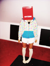
Photo Choices

This was the first photo we took for the shot on the magazine as Chloe "the girl in the picture" we chose her as she has blonde hair and a nice face structure however she is posing in the wrong direction and as we wanted the magazine to look as profesional as possible we decided to take another also because we didnt use a plain background the picture wouldnt cut out on photoshop, this meant we had to change the image.

so we used a white background and this picture were im facing the right way for our long shot as it cut alot neater.
Magazine Devices
We then looked at typical magazine devices like 3 fonts, 3 colours, coverlines, slogas, layers etc. We did this so we could evaluate our magazine in detail and so that we know the basic terminology for "words and pictures" that apear on the front of magazines.
Vogue- Magazine Devices
Vogue- Magazine Devices
Practice Magazine

This was the magazine we chose to re-create as our first attempt. We chose it as we are familiar with the magazine and we thought that the colour scheme was easy to recreate as this would be our firt time using photoshop. We also thought that the layout was interesting and the choice of position of the long shot covering the masthead and the position the model is in adds to how attractive thhe layout of the magazine is.
MEDIA Essay 2 The Royal Tenenbaums
For my second essay i was asked to choose a character from the opening sequence of The Royal Tenenbaums and analise them in terms of representation, including camera shots. I chose Margot Tenenbaums the apopted daughter of the family as i found her most interesting and different to the other chatacters, this made me want to analyse her behaviour in detail.
MEDIA Essay 2 the Royal Tenenbaums
MEDIA Essay 2 the Royal Tenenbaums
Monday, 12 October 2009
MEDIA Essay 1 Juno and Let The Right One In analysis
For my first media essay i was asked to watch the opening scenes of Juno and let the right one in and analyse how they are similar and different within their genres. I did this looking at camera shots, propps theory on character roles and what i could gain about the characters from the opening scene, i also looked at wat type of story was being told, how much was told and how it would effect the audience.
MEDIA Essay 1 Juno and Let The Right One In analysis
MEDIA Essay 1 Juno and Let The Right One In analysis
Thursday, 8 October 2009
Shots
BASIC SHOTS
Long Shots-typically shows the entire object or human figure and is usually intended to place it in some relation to its surroundings.
Establishing Shot-sets up, or "establishes", a scene's setting and/or its participants.
Medium Shot-is a camera shot from a medium distance.
Close-Up-tightly frames a person or an object. Close-ups are one of the standard shots used regularly with medium shots and long shots.
Angle Of Shot-is a shot from a camera positioned on the vertical axis.
Point Of View Shot-It is usually established by being positioned between a shot of a character looking at something, and a shot showing the character's reaction.
Two Shot-is a type of shot employed in the film industry in which the frame encompasses a view of two people.
Zoom-is a method of decreasing (narrowing) the apparent angle of view.
Pan-refers to the horizontal movement or rotation of a still or video camera, or the scanning of a subject horizontally on video or a display device.
Tracking-is a segment in which the camera is mounted on a wheeled platform that is pushed on rails while the picture is being taken.
Hand-Held-is a film and video technique in which a camera is literally held in the camera-operator's hands--as opposed to being placed on a tripod.
DANIELLE HAIGH PRESENTATION
I was asked as my first assignment to make a slide show on things that i enjoy and are personal to me.
DANIELLE HAIGH PRESENTATION
View more presentations from Dhag.
Wednesday, 7 October 2009
Subscribe to:
Posts (Atom)