Sunday 31 January 2010

Tuesday 26 January 2010

Contents pages


I like this contents page as it is simple & uses three main colours, despite using a limited amount of colour the page is still eye catching. The pictures used are cut different & set in the middle of the page to draw eye contact towards the center of the page. The text is all of a similar font but each heading it highlighted in a specific colour to outline it more. I personally really like the scrap book look of the 'band index' its different and appealing.

Magazine colour palettes


Monday 25 January 2010

Thursday 21 January 2010

Pitch Powerpoint

Rankin Florence + The Machine


Rankin

John Rankin Waddell is a British portrait and fashion photographer.
He has Photographed for GQ, ELLE, VOGUE, ESQUIRE DAZED & CONFUSED and various other maagzines like that. He also does fashion and beauty shoots around the world for various alisters.


After looking at various covers he has produced i decided i like this one best, at firts i had to look back at it again as i couldnt tell if that was actually Beth Dittos mouth, i like this idea it draws your eye to the magazine and makes it individual. I think rankins style of photography is very unique and has inspired me for my photography.

EAR CANDY

After coming up with various masthead ideas, i decided that SOS, (Sequence of Sound) inspired by NME & Ear Candy were my favorite and after thinking about my target audience and the style of the magazine i wanted to create.
I then looked at various fonts from my masthead and i decided that ear candy looks better when wrote out as apposed to SOS as it is short and easily disappears into the background and my front page will be very bright,bold and messy and i need to masthead to be clear eye catching.

Wednesday 20 January 2010

To do list from research feedback

Take Photos for Magazine DONE
Mock up of magazine DONE
Flat plan
Contents page & Double Page Spreads research DONE
Colours pallets DONE
by 1st February

Front, contents & page spread draft complete DONE

by 10th February so i can improve before 12th (deadline day)

Audience Profiling


Amelia is a 19 year old girl originally from south london where shew lived with her mum and dad and older brother Lewis. She is now in her first year at Leeds Univertity studying Photography and art and wishes one day to become a sucessful fashion photographer in America. She enjoys the buzz and general excitement of university life but when at home enjoys watching varios genre of film such as romamance, comedy, animated childrens films and the ocasional thriller she watches these films with her cat 'frederic' her ex boyfriend brought her for her 16th birthday. Her best friend is her ipod which has a playlist for film soundtracks, her favorite bands: Mystery Jets, The Killers & Arctic Monkeys and a playlist of female artists like Kate Nash & Paloma Faith, her ipod has over 2,000 songs. She has three close friends who she spent mosr of her childhood with, she often catches up with them over a starbucks or a vintage shopping spree when in london!

Thursday 14 January 2010

Female Artists

Florence Welch and a collaboration of other artists who provide backing music for her voice. Musically Florence and the Machine's sound is generally referred to as soul-inspired indie rock.


Daisy Dares You


Kesha Rose Sebert better known as Kesha (stylized as Ke$ha), is an American recording artist, whos music is described as pop,dance and electronic.


Katheryn Elizabeth Hudson, better known by her stage name Katy Perry, is an American singer-songwriter and musician whos music is described as pop rock.


Lily Rose Beatrice Allen is an English recording artist, talk show host, and actress who music is Pop, rock, ska, electropop, grime.


Paloma Faith is a British singer and actress whos music is soul, pop & soft rock.


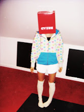
All of these artsist have a unique style that is shown within their music & fashion sense. All of these artists have helped me decide on the particular image i want my artist/model to put across. i have decided to use a girl i know called Lia Lowe she has done abit of modeling before so she should act well infront of a camera, i have chose to use her as her style is very much like all of the above & she is tall, very skinny & has long messy hair like your average model.

Wednesday 13 January 2010

INITIAL IDEAS

www.dafont.com

COMIC
- I Hate Comic Sans
OLD SCHOOL
- Freshman
HANDWRITTEN
- BBY Cakes
VARIOUS
- Mental Freak
Walk Around The Block
Caitlyn

NYLON


Nylon is an American magazine that focuses on pop culture and fashion. Its coverage includes art, beauty, music, design, celebrities, technology and travel.

Nylon magazine reminds me of a younger more Urban Vogue.
I like it because it is messy and unlike Vogue does a woman's and a men's magazine, i like this because most magazines are either for women or for men. Nylon does one for each. This particular magazine has the same qualities as Super Super as it is messy, colourful and bold.

I chose to analyse this cover as it is 'The Music' issue. I really like the way the masthead and the slogan 'school of rock' looks hand written and edgy. There are alot of cover lines on the front and compared to some of the minimalistic covers Ive looked at i think i prefer the more messy creative ones. i also like on this cover how some parts have been highlighted and that three colours have been used, bright eye catching ones to generate attention to the cover. There is a range of fonts used and different sizes this adds to the unorganised order of the page.

LOOKBOOK

lookbook.nu


Look Book is a website for the 'collective fashion consciousness'
it allows people to uploads photos of themselves wearing clothes or photography of other people and recieved comments on them.
it inspires me alot, id say i look atleast once a day at what has recently been posted this will help me in thinking of possible poses and camera shots for my shot(s) within my magazine.

MY PROFILE

http://lookbook.nu/hmmhag

WOW


I LOVE THIS

DAZED & CONFUSED

Dazed & Confused is a British style magazine,that was set up in 1992 and published monthly. Its founding editors were Jefferson Hack and Rankin. Topics covered include music, fashion, film, art and literature.


Both these covers use models i have already looked at on, the one to the right uses Luke Worrall and to the left Ash Stymest.

I'm inspired by both covers as they are very minimalistic but they still are eye catching maybe because of the choice of photograph and the positioning on the page. Both photos are very suggestive and provocative and the slogan on the one on the right "sex me up" suggests that this magazine could quite easily be for an adult target market which is very wrong & you would work this out when you opened the magazine, i like this as it is very mysterious. I also like the way the masthead is layed out on the front as it is different to other magazine mastheads. The cover lines are fairly basic and minimal also. Unlike other magazines Dazed & Confused uses two colours on the front of their page like black and red or grey and white. I like this as it adds to the minimalistic style of the magazines and breaks 'the rules' which this magazine does alot.

Monday 11 January 2010

PITCH

Genre- Indie/Electronica.
Target Audience- Teenage to Late 20's. Men & Women.
Mathead- ear candy/food or SOS(sequence of sound) Whatt.
News paper cut out letters.
Myfonts.com.
Scrabble letters layout.
Photographd- Polaroid, sequence of photos all over the front page. (Messy!)
Two Boys -Urban / Indie wear.
Colour- Bright colours & Blsck and white

Tuesday 5 January 2010

POLAROID


I like the idea of using a strip of Polaroid images on the front of my magazine as they are very different and look retro and compliment the style of music I'm looking at.

SS


SUPERSUPER ISSUE 19