

I like the use of varied text on this double page spread & how the lack of colour draws the eye to the picture where the colour is more significant and important.

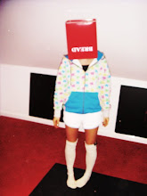
The photography on this double page is what inspires me most as it is different and reminds me of a quirky style not just following with whats in, you would expect this though from a fashion magazine.

I like this page as it is split well across the two pages, I like the cut outs of photographs and the interesting titles. The text being in the middle is also different, still in columns but set out in a different style to your average article, the names of people in bold is also inspiring not necessarily the names but just putting certain parts in bold i also think is a good idea.


Dani,
ReplyDeleteyou continue to post really interesting elements. You need to ensure that you place them in the correct context by explaining them with text.
e.g.: the images from the photo shoot are really good. what is lacking is any sense of which you would want to use for the final piece of work and which are included just to give an idea of the fun you had creating the work.